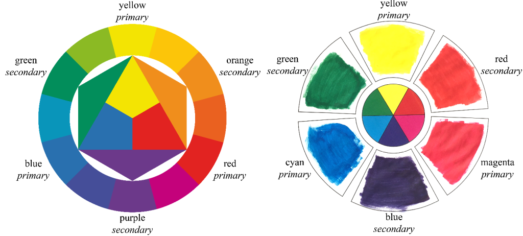
At primary school you were taught that there are three primary colours: red, yellow and blue, and that you can mix these to make all other colours. This is not true. Or rather, it is only a rough approximation to the truth. My recent article, published in the Journal of Perceptual Imaging, digs into the history of colour wheels and colour mixing to find that the truth is more complex and more interesting.
The idea that there are three primary paint colours was discovered in the seventeenth century. Different artists used different shades, which were roughly reddish, yellowish and bluish. This theory was consolidated in the 1950s by Johannes Itten, the influential painter, teacher and theorist associated with the Bauhaus. Itten created the colour wheel that is today taught in most art classes and primary schools.
Itten has a red-yellow-blue triad of primary colours. But Itten’s primary triad is strongly tied to the way we use language rather than to the physically correct colours for mixing. The correct colours for mixing are magenta, yellow and cyan, the colours of ink that you buy for your colour printer. Yellow is common to both sets. Cyan is a green-blue. Magenta is somewhere between red, purple and pink. And in that explanation of cyan and magenta lies the linguistic problem. Neither cyan nor magenta is a basic colour term, whereas red, purple, green, blue, pink, and yellow all are. Itten’s primaries are basic colour terms and Itten uses the language of colour to define the primaries that he uses.
In the late 1960s, Brent Berlin and Paul Kay proposed the theory that there are basic colour terms in all languages. These are the terms that you teach small children and which produce categories of colour that are irreducible, that is, all other colour terms are considered, by most speakers of the language, to be variations on these basic colour terms. In English, and most other European languages, there are eleven basic colour terms: red, orange, yellow, green, blue, purple, pink, brown, black, grey, and white. As an example of the irreducibility of these basic terms, consider how difficult it is to convince a child that brown is really ‘‘dark orange’’ or that pink is ‘‘light red’’. You may teach a particular child or student to make finer distinctions, as between ‘‘cyan,’’ ‘‘azure,’’ ‘‘indigo,’’ and ‘‘turquoise,’’ but there is a cultural push toward teaching and agreeing on the eleven basic colour terms, and there is demonstrated effect of these basic categories on the ability to perform colour discrimination.
The language of colour strongly influenced Itten. In Itten’s seminal writing on the colour wheel, The Elements of Colour, he writes: ‘‘…a person with normal vision can identify a red that is neither bluish, nor yellowish; a yellow that is neither greenish, nor reddish; and a blue that is neither greenish, nor reddish… The primary colours must be defined with the greatest possible accuracy.’’ There is no freedom here to allow red to be magenta, because magenta is a red that is distinctly bluish, nor is there freedom to allow blue to be cyan, because cyan is a blue that is distinctly greenish.
My analysis of colour models shows that Itten’s approach, while deeply appealing, is physically incorrect. Just because we can all agree linguistically on the prototypical basic red, yellow and blue does not mean that these are the correct colours to have as your primaries. Physical analysis of colour shows that magenta, cyan and yellow give the best primaries for mixing the maximum range of colours. My paper shows that all of the technical colour models broadly agree on this, and that Itten’s colour model is an outlier. My conclusion is that this is because he puts special emphasis on the colours that are linguistically and culturally determined to be somehow “basic”.
Now this is not necessarily a bad thing but there is a challenge for educators. When students start their technical training, at university or in an apprenticeship, we need to teach them to forget what they have known since primary school about colour. We need to take them deeper into the physical and psychophysical properties of colour. We find this a challenge firstly because people are very attached to what they learnt in the early years of their lives and secondly because we do not ourselves necessarily understand why the red-yellow-blue colour wheel is technically incorrect. My work helps us to understand how it developed and, in understand that, we are better able to transition students to the more accurate technical explanation of colour mixing.
Article available either as a pre-print or from the journal’s website.

Excellent post and paper, and thanks for the references to my website! I’d be very interested to hear what responses you get. Best regards, David Briggs.
Most tertiary art institutions are still teaching this and the non-quantifiable color harmony concept. A simple search will find syllabi from even world-class tertiary institutions using the Itten Color Wheel and the concept of harmony as their color theory teaching framework. It will take a lot of effort and time to change this. The change has to start from Primary schools.